Woda
Poetry Zine Design
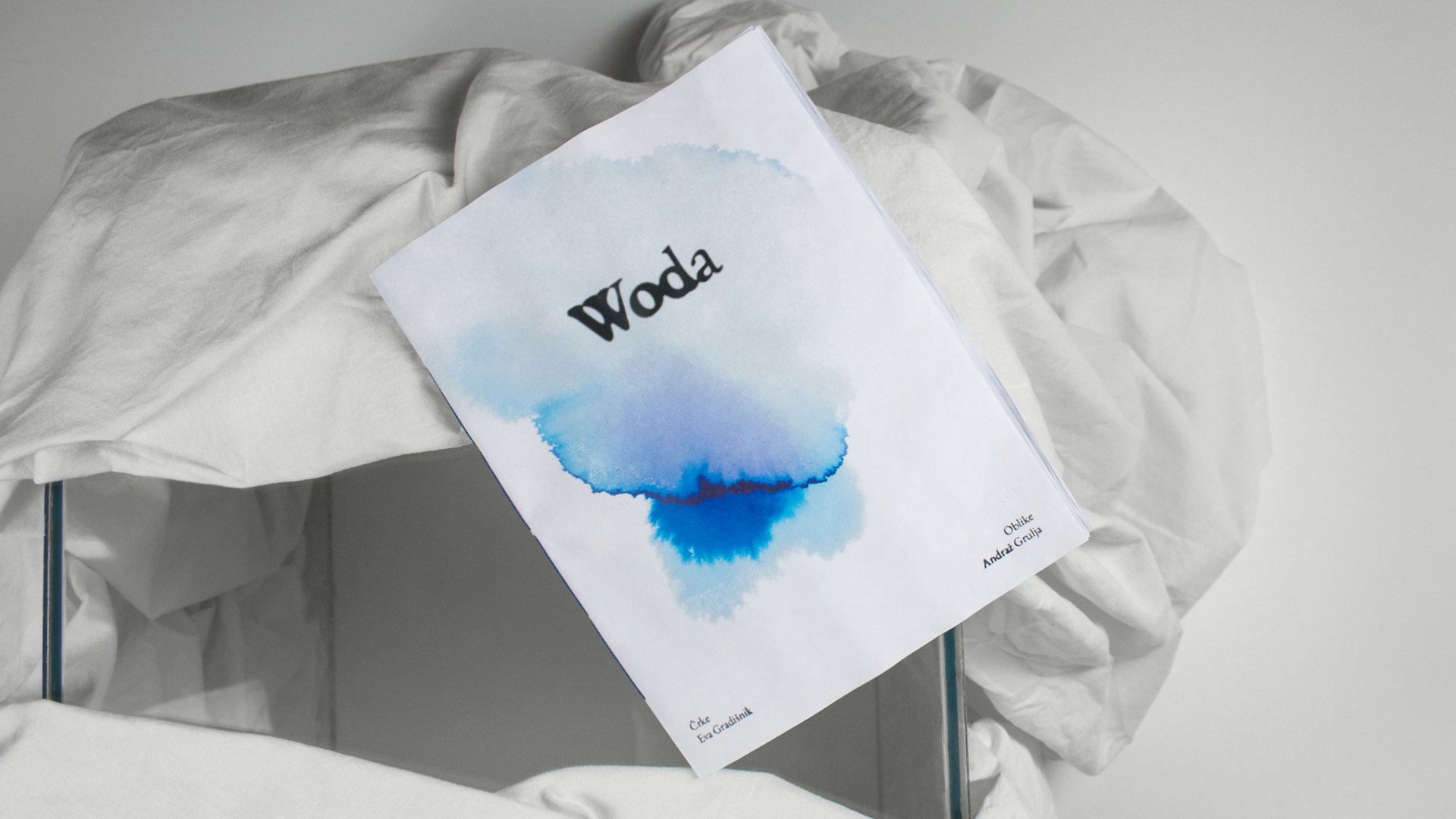


Everything in the world has emerged from water – you, me, and even this zine. Not only its content, but also its form, typography, pages, and packaging. Before the reader plunges into the content, the zine must be first immersed in water. Only then does the bag containing the zine dissolve and reveal the letters and shapes.
Before reading, we want to invite readers to take time for their water ritual. By actively involving them in the process, we enable them to create a zine that is uniquely theirs. When they soak the zine, the pages ripple according to the time and liquid type they immerse it in: sea, tears, or chamomile tea. Despite its allure, we advise against using red wine. This way, the zine acquires a unique shape, which we believe alters the way the letters are read. More profoundly and more intimately.
The content of the zine was washed up during various interactions with water, and we wanted it to remain in its natural form – fluid, unstructured, and organic. It is written in typography that appears as if it has been watered down, as evidenced by the spilled and scattered letters. Water (literally) also flooded the illustrations, which we poured onto paper one winter evening. Because we wanted the entire zine to be as authentic as possible, we also took care of the binding ourselves. The packaging is made of water-soluble material that dissolves upon contact with water.
The water zine gives the reader the opportunity to pause. To immerse themselves in the moment and remember their primary state, which is fluid, organic, free, wet.
Author: Eva Gradišnik
Designer: Andraž Grulja